


April 30, 2007
Ghostly Haunts #26 [1972]
Nice effect on this cover with all the levels, building up a real sense of depth. The smoke monster is also cool, but the best part of the cover has to be those creatures carved into the walls of the cave.
April 29, 2007
This Magazine Is Haunted #19 [1954]
Not a bad cover, but also not nearly one of the best of Ditko's pre-code covers. A lot of nice individual touches, like the detail in the house in the background, the fog effect, a few details in the clothes of the invisible ghost. Unfortunately, it takes a while to realize that he's even going for a "tearing through the cover" effect, when that kind of thing, when done, should jump out at you as the very first thing you notice about a cover.

April 28, 2007
Ghostly Tales #90 [1971]
I don't know about you, but I think I'd find the giant, staring face of Mr. Dedd coming out of one wall more disconcerting than the ghost with a cane. Interesting effect on this cover, all those odd angles really make it disorienting.

April 27, 2007
This Magazine Is Haunted #21 [1954]
Some gory pre-code voodoo fun from one of the few comics to have a complete sentence as a title. Those are some pretty big needles...

Many Ghosts of Doctor Graves #28 [1971]
Hm, this cover concept looks familiar...
Yet another Graves/Strange connection here. For that matter, the sorcerer on the cover could very easily be the Ancient One. A lot of nice touches here, from the elements of the cover literally coming off the page to the flying brickwork.

Yet another Graves/Strange connection here. For that matter, the sorcerer on the cover could very easily be the Ancient One. A lot of nice touches here, from the elements of the cover literally coming off the page to the flying brickwork.
April 26, 2007
Gorgo #4 [1961]
This is an odd one, took me a while to figure it out.
Ditko drew a lot of issues of GORGO for Charlton, based on the 1961 movie. A lot of the his covers for the series were, in typical Charlton manner, made up of interior panels. For #4, where Ditko didn't do the interiors, they made the strange decision to go back to #1 and do the cover from the spectacular Ditko splash page of that issue, modifying it slightly (the guy sitting on Gorgo's head is new).

Ditko drew a lot of issues of GORGO for Charlton, based on the 1961 movie. A lot of the his covers for the series were, in typical Charlton manner, made up of interior panels. For #4, where Ditko didn't do the interiors, they made the strange decision to go back to #1 and do the cover from the spectacular Ditko splash page of that issue, modifying it slightly (the guy sitting on Gorgo's head is new).
Ghostly Haunts #30 [1973]

The big white gap in the painting really captures the eye right away, then the classic Ditko eye leads the viewer right to that shadow of the creature coming in from outside, then the elements circle around until you get the brushes pointing back to the original eye-catching element of the painting.
And Winnie the Witch adds the icing on the cake. Oh, Charlton horror hosts...
Of the 1970s covers in this series of cover-only posts, this is definitely among my favourites.

April 25, 2007
--Link-- Thing redone
In a comment to a recent post, Howard Hallis, who probably has more experience designing Doctor Strange covers than anybody, provides a great variation on the THING #17 cover.
Many Ghosts of Doctor Graves #55 [1976]
 A very simple design on this one, but I do like the use of negative space to define the imposing shape of the monster of the issue, and you can see that Ditko put a lot of work into it, with the tiny little traces of fur on parts of the creature and the contrast in hatchwork on the roof where the shadow falls.
And look at that woman. Was Ditko having flashbacks to sharing a studio with Eric Stanton a decade earlier or something?

April 24, 2007
New Ditko - Spider-Man Omnibus
Out this week, THE AMAZING SPIDER-MAN OMNIBUS. Every Ditko and Kirby/Ditko Spider-man story from the cover of AMAZING FANTASY #15 to the last page of AMAZING SPIDER-MAN #38, plus various extras bringing it up to 1088 pages total.
See your local comic shop or bookstore, or various on-line vendors, including amazon.com above or Tales of Wonder.
See your local comic shop or bookstore, or various on-line vendors, including amazon.com above or Tales of Wonder.
Ghostly Tales #94 [1972]
Nice feeling of depth and movement in this cover. And I always like that kind of just slightly off way that Ditko drew animals.

April 23, 2007
Ghostly Tales #96 [1972]


April 22, 2007
Strange Suspense Stories #22 [1954]
Ah, creepy eyes full of fear. A classic Ditko motif.

What's in the mystery glowing book causing that look of fear? Does it really matter. Great cover, with the ornate designs on the box, the fearful, sweat-drenched face and the candle in the foreground.
I was going to declare a favourite Ditko cover-only book when I got through posting them, but that's going to be too hard a choice. Even dividing them into pre-code and post-code it's going to be a hard call.
This Magazine Is Haunted #16 [1954]
Underwater revenge-seeking zombie pirates in chains? Man, this is like the best issue of TALES OF THE BLACK FREIGHTER ever!
This is definitely in the running for Ditko's best pre-code cover, at the very least. Not much more I can say about it. Just drink in the zombie goodness.

This is definitely in the running for Ditko's best pre-code cover, at the very least. Not much more I can say about it. Just drink in the zombie goodness.
April 21, 2007
Ghost Manor #6 [1972]

I especially like the tight hatching job done on the ghost to indicate the robes of the characters in the background where they're covered by the semi-transparent ghost.
And while it's probably not done by Ditko, the story title logo on the grave, is really nicely done, and the story teaser on the other grave is a nice touch.

Admin - Comments feed
Just realized I could do this, and hopefully it'll encourage more comments on this weblog, since it'll make it easier to keep up with comments and replies. You can now see recent comments over on the sidebar, or get them automatically in your rss reader of choice (I'm very happy with the Google Reader, and also liked Bloglines). You can use this link:
http://ditko.blogspot.com/feeds/comments/default
You can also subscribe to the comments for any particular post, using the link with the title "Subscribe to: Post Comments (Atom)" on the bottom of each page.
The main feed for the site is:
http://ditko.blogspot.com/feeds/posts/default
http://ditko.blogspot.com/feeds/comments/default
You can also subscribe to the comments for any particular post, using the link with the title "Subscribe to: Post Comments (Atom)" on the bottom of each page.
The main feed for the site is:
http://ditko.blogspot.com/feeds/posts/default
Racket Squad in Action #12 [1954]
 Wow, I hope that's not actually the racket squad in action, but rather the racket they're going to have to act against. Because that would be some really bad stuff coming from the racket squad.
Some more from the early Ditko, this cover doesn't quite work for me, although it's very brutal and striking and has a lot of strong individual points. Having the kid getting blown up already with a cane even before the explosion seems like unnecessarily stacking the deck on the pathos. And the Ditko tie on the bomb thrower is nice.
I also like the various ways Ditko put his signature on many of these early covers (on the crate, below the exploding boy).

April 20, 2007
Outer Space #21 [1959]
 Damn, that's a big, obtrusive promo blurb on that cover.
Otherwise it's a pretty good cover. At first I thought it was one of those unusual "friendly alien" covers, rescuing some American astronauts, contrary to the vast majority of "alien menace" imagery in comics and pop culture of the era, but looking closer I think those humans are captured prisoners of the alien. Damn sneaky aliens, can never trust them.
Also, Ditko's vision of alien architecture, in this case the giant floating space centre, presumably the space POW camp in the space war, in the background, is always a delight.

Ghostly Haunts #56 [1978]

Plus of course some great hands. What is that weird pose with the two middle fingers tightly together and the other fingers spread out? I was just trying it, and it is not a pose that comes naturally to my fingers, at least, although it does look cool when Ditko draws it.

April 19, 2007
Beyond The Grave #6 [1976]

Unfortunately spoiled a little in the production by that superfluous Charlton logo slapped on one character's face. Let me go back in time 30 years and send Charlton a memo:
Attn. Charlton:
Re: extra logos defacing Ditko covers
You should know that reminding people that they're buying a Charlton comic by spoiling the artwork on some fine covers is counter-productive. For the most part people are not buying books because they're from Charlton, but despite it.
Thank you for your attention.

April 18, 2007
Cheyenne Kid #10 [1957]
Despite westerns being a major genre in comics throughout Ditko's earliest days in the industry, especially among his major publishers Charlton and Marvel, he only drew a handful of short western stories in his career, and many of those starred horses (Black Fury and Black Jack). I guess he just didn't have an affinity for that genre...
Wait, CHEYENNE KID #10 has a message on that topic from 1957, and that message is:
 WRONG!
Ditko just drew the cover to this issue of one of Charlton's many western books of the era, but what a cover it is. Action-packed, very clearly composed and full of detail in every corner, almost a throw-back to Ditko's pre-code covers in that regard. This is right up there with some of the best western work I've seen from the era, like the Simon&Kirby BOYS' RANCH, and looks like it could be a movie poster (though that blurb on the cover is poorly placed and a bit annoying).
I'd wonder how anyone could look at this and not throw the artist as much western work as he could handle, except that I know Ditko was just as strong on the fantasy and sci-fi work (and would later go on to help reinvent the super-hero genre). So add westerns to something that Ditko does well, if not often.
It's kind of odd, you'd think that the black-and-white morality plays of the western genre would appeal to the later philosophical leanings of Ditko. I'm just imagining Mr. A done as a western. The A Kid? Two-Gun A? Shoot-out at the A-is-A Corral?

Wait, CHEYENNE KID #10 has a message on that topic from 1957, and that message is:

Ditko just drew the cover to this issue of one of Charlton's many western books of the era, but what a cover it is. Action-packed, very clearly composed and full of detail in every corner, almost a throw-back to Ditko's pre-code covers in that regard. This is right up there with some of the best western work I've seen from the era, like the Simon&Kirby BOYS' RANCH, and looks like it could be a movie poster (though that blurb on the cover is poorly placed and a bit annoying).
I'd wonder how anyone could look at this and not throw the artist as much western work as he could handle, except that I know Ditko was just as strong on the fantasy and sci-fi work (and would later go on to help reinvent the super-hero genre). So add westerns to something that Ditko does well, if not often.
It's kind of odd, you'd think that the black-and-white morality plays of the western genre would appeal to the later philosophical leanings of Ditko. I'm just imagining Mr. A done as a western. The A Kid? Two-Gun A? Shoot-out at the A-is-A Corral?

--Link-- Shaw! on Oddball Adult Fantasy
Scott Shaw!'s Oddball Comics turns its (injury-to-the-)eye towards the Ditko filled AMAZING ADULT FANTASY #9 in this recent entry.
http://www.oddballcomics.com/article.php?story=2007-04-09
http://www.oddballcomics.com/article.php?story=2007-04-09
April 17, 2007
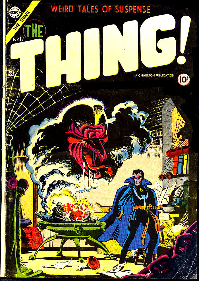
The Thing #17 [1954]

It's been said (by me, if no one else) that a lot of Ditko's early education in comics was learning what to leave out, with his heavily detailed early work being all wrong for the level of pay and print quality that comics of that era offered. Here's a textbook example of the level of work he did in that period, one of the last published pieces from his brief first stint at Charlton. He tossed everything into this. Multiple spider-webs, chains, a skull, potions, books, the shadow of a gargoyle, curtains, scraps of paper, a crazed wizard in flowing robes and a drooling demon with a sharp tongue emerging from the smoke. I don't know what Charlton was paying back then, but it certainly wasn't enough to justify getting this in return. And while it looks good on the cover (though I'm sure we still lose a lot from the original art), half of this wouldn't come across on the interior printing of the day.
This is another contender for the best of Ditko's cover-only books. It's also has a strong argument for the best of the less than two dozen pre-code covers he did. Just brilliant stuff.
I have to admit, I was tempted to take this scan, strip off the colour and Charlton trade dress, replace it with some Marvel splash page elements from circa 1964, with a blurb about Hoggoth, the Vishanti, Agamotto and all that jive, a few words like "effendi" and a title like "The Menace of the Other Ancient One" and pass it off as the splash page of a lost Doctor Strange story. But that felt too much like work. If anyone does that, feel free to post it (I can send you a larger scan of the cover if you need it) and I'll give you a permanent link over on the side-bar.

Space Adventures #12 [1954]

Ditko's obviously showing a strong influence from the then-current EC sci-fi comics of the era, in particular Wallace Wood and Al Williamson, with the female astronaut being attired in an outfit that is impractical at best (high heels and a conveniently transparent suit over a form fitting suit). That's also a magnificent alien.
And I know some people dislike dialogue on covers, but can even they argue that it works on this one?

April 16, 2007
Unusual Tales #6 [1957]
 "You're gonna need a bigger boat."
It's almost impossible to pick a favourite of the Ditko cover-only images, but this one has to be a leading contender. This is fairly early in Ditko's return to Charlton in 1957, after a two year gap where he did a handful of stories for Marvel and not much else. He came back strong, as you can see, with an absolute masterpiece this time around. What really works about this cover is that it completely draws you in, you can't help but want to spend a dime on this, but it's also pretty much complete in itself. I don't know if there's a story in this issue to go with the cover, but do you really need more of a story than you get here, with a perfectly realized monster fish, the reactions of the fishermen, the chaos of the breaking waves.
And, one of the rarest sentences in the English language, kudos to the Charlton production team for some great work on the colour and overall composition of this cover.

April 15, 2007
Shadows from Beyond #50 [1966]
I've been buying some old Charlton books lately, and was looking on-line at some of the covers so I know what to look for in terms of Ditko stories I don't already have, and I was struck by how good some of the images on books with Ditko covers only are, even though my intent was to identify them so I know to avoid buying them for now in favour of books with Ditko interior art. So I'm going to run a bunch of them here for the next little bit. Scans are from various on-line sources (the GCD (especially this sub-site), various vendor/auction sites, etc.) so quality will vary.
Charlton being Charlton, #50 is the only issue of this title, continuing the numbering from UNUSUAL TALES, while BLUE BEETLE also continued the numbering from UNUSUAL TALES. Oh, Charlton, how at home you'd be in this modern era of backwards numbering, "#0", "#1/2", etc. Anyway, Ditko had been back on Captain Atom for a little while when this came out, and it's an excellent little example of his more playful, design oriented stylings. It might have been better without those little typeset labels. Not sure if Ditko did those or it was someone at Charlton. He did sometimes use that kind of labelling in his fanzine/small-press work, but usually more meaningful and better designed. The cover ran without them, but with an equally obtrusive UPC code, on GHOST MANOR #75 [1984].

Charlton being Charlton, #50 is the only issue of this title, continuing the numbering from UNUSUAL TALES, while BLUE BEETLE also continued the numbering from UNUSUAL TALES. Oh, Charlton, how at home you'd be in this modern era of backwards numbering, "#0", "#1/2", etc. Anyway, Ditko had been back on Captain Atom for a little while when this came out, and it's an excellent little example of his more playful, design oriented stylings. It might have been better without those little typeset labels. Not sure if Ditko did those or it was someone at Charlton. He did sometimes use that kind of labelling in his fanzine/small-press work, but usually more meaningful and better designed. The cover ran without them, but with an equally obtrusive UPC code, on GHOST MANOR #75 [1984].
April 14, 2007
Many Ghosts of Doctor Graves #24 [1971]
 "The $5.99 Special" is the 8-page Ditko illustrated story in this issue. The basic story doesn't actually make too much sense. A cop arrests a woman for trying to sell him a fake love amulet, only to have the case thrown out by the booking officer since he didn't actually wait until money had changed hands. The two then go on a date, and I guess we wind up finding out that she really is a witch, but didn't know it up until now, and gets comfortable with her powers quickly. And then they live happily ever after. It's all very strange.
The art is much more interesting, if equally strange. This is one of those Charlton stories where the host (Doctor Graves in this case) does more than just narrate the story, but less than actively participate in it, with odd little panels floating between the panels of the main story, showing Graves observing what's going on. I'm not exactly sure what visual effect Ditko was going for, sometimes it seems to be a floating smoke effect, other times a jigsaw puzzle, or a lavalamp. The odd panel shapes get even odder later in the story, with heart-shaped panels when the characters kiss. Whatever the intended effect is, it's an interesting way to liven up a fairly bland story.
Ditko also draws the cover to this issue, also for this story, which has a pretty cool visual of a skull in a crystal ball.

April 8, 2007
Marvel Tales #141 [1982]

After the customary symbolic splash page, we start with Spider-Man seeing some suspicious characters casing a jewelry store as it closes for the night. Unfortunately, he jumps the gun on nabbing the potential thieves before they actually break the law, and they know it, calling on the police themselves, taking advantage of the mistrust of Spider-Man that J. Jonah Jameson has been sowing. After dropping by Jonah's office to leave a small token of his affection, Spider-Man runs into the Sandman for the first time, finding him hard to handle, and is forced to flee when his mask rips. Back home he get an early version of a Spider-Man classic, Peter trying to sew his costume while hiding it from Aunt May, while he also gets the background of the Sandman from the TV. The next day Peter drops by the Daily Bugle office, just as Jonah needs a new pair of pants due to Spider-Man's little gag, and then goes to school. As luck would have it, Sandman runs from the police right into the school, and that's where he and Spider-Man have their showdown. Ditko really shines in the choreography of the fight through the school, full of great visuals playing the Sandman's powers and Spider-Man acrobatics to full effect. I especially love the whole sequence on the page scanned here, with Sandman using his powers to solidify himself right around Spider-Man's arm, then head-butting him, only to have Spider-Man flip him right over and smash his head into the stairway. Spider-Man finally beats the Sandman with the clever ruse of distracting him with a drill, so he takes his full sandy form and can be easily sucked into a vacuum cleaner.
And then, in one of my favourite bits, Spider-Man uses some sand from the fire-bucket to fake a few photos to sell to JJJ. While that works out for him, he's still got to face the scorn of his classmates, and we get a nice panel on the last page of people with scepticism to his exploits, but he decides to has these powers for a reason and has to continue being Spider-Man.

Just about everything that makes the Ditko Spider-Man masterful is in this story in its purest form, with an iconic villain with a clever visual hook, Peter's relationships with Aunt May, JJJ, his classmates, the police and the general public, an exciting action scene that resolves itself with a mix of brains and muscle and an overall way of thinking about super-heroics that was revolutionary at the time, and is still effective today.
April 4, 2007
Revolver #4 [1986]

Boy, Ditko does like creepy hand-based storytelling, doesn't he? Cute little story, a few bits about the guy pursuing the cursed thief might have been a little clearer, but I liked it. Some of Ditko's work that appeared in REVOLVER was clearly meant for Charlton, and this one looks like it might have fit there.
[see comments, Nick mentions that it was probably for a Whitman/Gold Key line of the time that was discontinued before any of the Ditko work they had lined up was published]

Ditko also does the cover for this issue, based on the story, a great piece with a mummy, a giant green hand, huge floating eyes, and more.
April 1, 2007
Shadows & Light #1 [1998]
 SHADOWS & LIGHT was a short-lived anthology title from Marvel featuring black and white stories. Ditko contributes story and art for a 12-page Iron Man story, "A Man's Reach...!", to this issue, with scripting by Len Wein. This may be the last new work he had published by Marvel (though I half-suspect it might be a holdover from many short stories of this kind he did back around 1990 instead of newly commissioned for this book. But Ditko didn't usually get to ink those, and some of the shading here looks like what Ditko would do for a story meant for black and white publication, so perhaps not).
Whatever the origins of the story, it's a pretty typical old-school Iron Man short, with Happy and Pepper being attacked and Pepper taken hostage by villains who steal an experimental device that Stark Industries is working on. Iron Man goes to the rescue, endangering a business deal as Tony Stark, and falls victim to the experimental device (as well as a hired thug named Longarm with arms stolen from Doctor Octopus. I wonder if Ditko put that in or Wein just added it because of the similarity in designs?). Fortunately Pepper is able to help out with a well timed kick taking out the device and then later her ear identifying the criminal mastermind.
A bit old-fashioned for the time, but not a bad little story. Ditko's art kind of varies in it. Most of it is pretty decent, a few places are really nicely done, with interesting inking techniques, but in other places it looks a bit sloppy.
This issue also features short biographies for the creators before each story, although managing to do so for Ditko without using the "created" word when mentioning Spider-Man and Doctor Strange.

Subscribe to:
Posts (Atom)
